“Blanding” in the Art World: When Cultural Logos Lose Their Identity
Why do all cultural institutions’ logos look the same?
Scrolling through my Instagram feed lately feels like one big déjà vu. I read news about events, talks, exhibitions, and yet I can’t remember who posted them or where they came from. Fatigue? Maybe. Distraction? Definitely. But there's something else—a feeling of alienation and confusion: am I the only one seeing cultural institutions' profile pictures all looking the same?
I check my list of followed accounts, and here comes the confirmation: a lineup of logos from museums, foundations, and magazines that are only imperceptibly different from one another. How can one navigate this sea of identical ships? Where has the specificity of a place gone? Where are the symbols that communicate and represent a museum’s mission? What happened to the uniqueness that makes a difference?
So I decide to step out of this maze of thoughts and ask professionals for their insights: Beatrice, freelance graphic designer; Filippo, graphic designer and art director; Daniele, digital strategist; and Giorgio, art director and graphic designer.
The initial question was the same for everyone: “Logos of cultural institutions—especially on social media—have started to look the same in recent years: black linear text on white backgrounds, or sometimes white text on black, but always with the same visual setup. Is this just my impression, or are there specific ‘rules of the game’ behind this trend?”
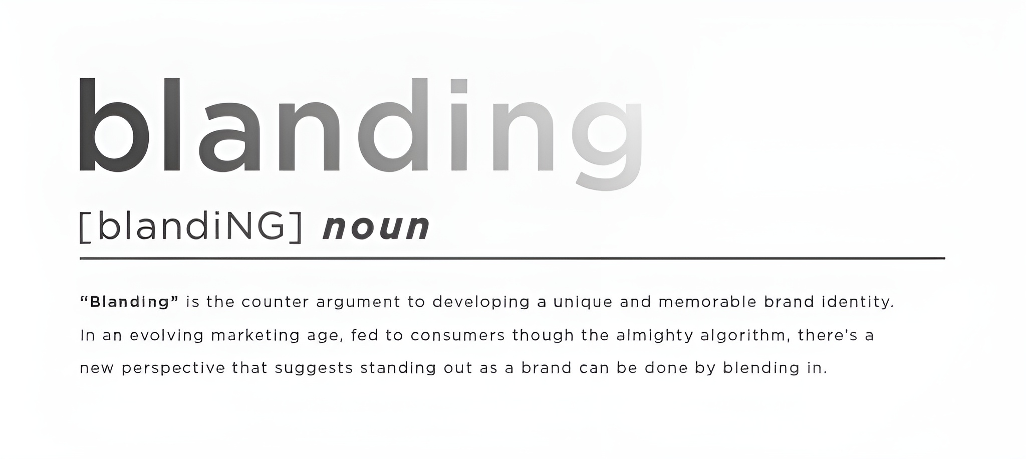
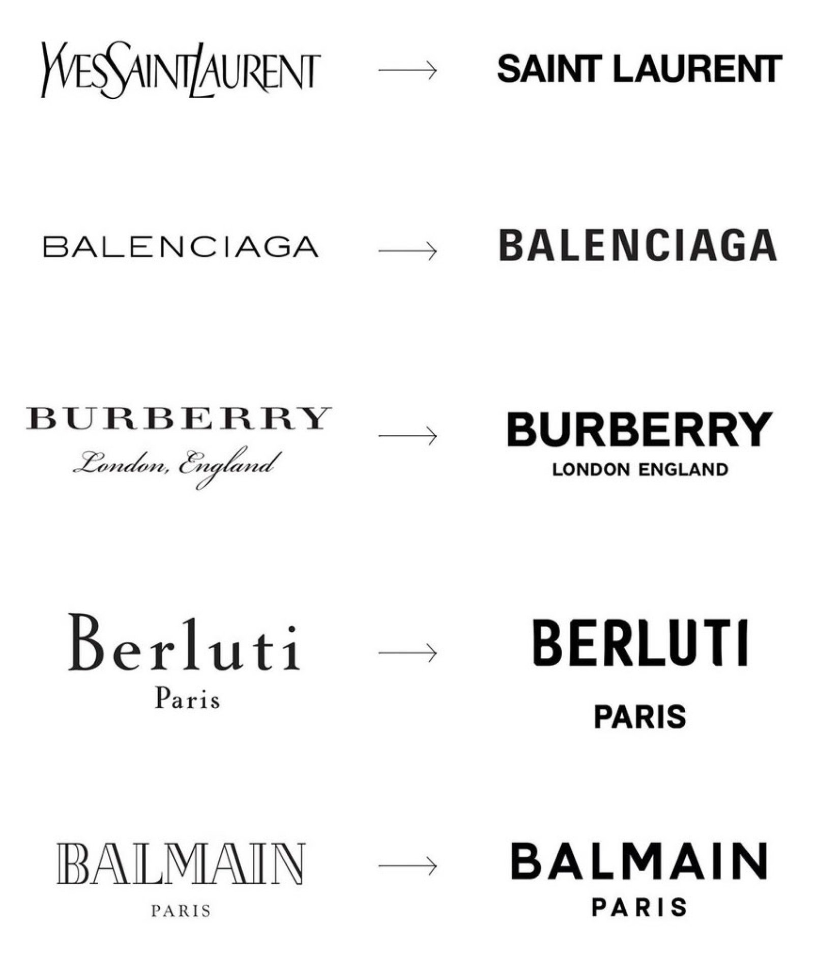
Beatrice immediately suggests I look up the phenomenon of Blanding, a trend that emerged around 2018, initially in the fashion world, marked by the replacement of historic and familiar logos of fashion houses with sans-serif fonts and “the reduction of identity in exchange for an appearance that limits differentiation from competitors” (Fontanesi, Lampoon Magazine, 2023). The real motivations behind this trend are not entirely clear and touch on issues such as the perceived brand value versus the intrinsic value of products, detachment from styles associated with historical eras full of questionable values, the fluidity of the modern world grappling with diverse means of communication, and plain marketing strategies.
Filippo reassures me that this is anything but a random trend.
“The similarity among logos of cultural institutions—especially museums, foundations, and art centers—follows precise logic tied to a specific vision of visual communication's role in the cultural world. Their identity is built on a sober, often monochromatic visual language. It’s a choice that aims for clarity, neutrality, and authority. Its roots lie in Swiss design. But Massimo Vignelli was a master at teaching how to do it. The logos of institutions reject ornament and embrace moderation because the content—a painting, a photo campaign—needs to be the focal point. Visual communication frames it modestly yet deliberately. Unlike a commercial brand, a museum shouldn't seduce or invade the viewer’s visual space. It should build trust and be recognized as a place of thought and free access to culture. And paradoxically, the more you remove, the stronger the message. That's why minimalist visual identity is so widespread today—and always has been. But it's a delicate language, not easy to digest or manage. Managing such a distilled identity requires sensitivity. When minimalism is done well, it supports. That’s when it works.”
Daniele gives a similar answer, referencing a return to typography and attention to visibility/accessibility concepts, expressed through strong contrasts, clear text, and legible fonts. He adds: “On social media now, it’s no longer the logo but the content that shapes perception.”
Giorgio agrees:
“I think logos now play an ancillary role in communication. They haven’t been central for a while. Brand exposure is no longer crucial. The memory part often relies on the architecture of imagination, which now must be much more dynamic and changeable. If a logo has highly distinctive shapes, it’s hard to pair with new imagery. If it’s very neutral, that impact is reduced. I’m not sure this trend will last, but even brand colors are becoming less important.”
 Blanding, Source: IG @giuliana_matarrese
Beatrice, after the tip about Blanding, joins this line of reasoning but adds two more aspects to consider: the readability of logos on digital devices, which “are compressed more effectively if they are more minimal, neutral, and less detailed than curvilinear ones,” and the fact that cultural institutions don’t want to appear as “commercial brands.”
Therefore, “the logo becomes an element that makes room for cultural content — exhibitions, events, artworks. It’s an ideological choice: ‘we are not the message, we convey it.’”
The questions in my head keep multiplying. Words like positioning and differentiation feel more and more blurred and inconsistent. But above all: if the logo has become marginal, then the communication of the mission must be extremely strong to build a resilient and persistent imaginary in today’s dynamic world, without symbolic or chromatic graphic support. Does this mean that coordinated communication is now only about content? And how can this content be distinguished if I don’t have specific references—or if those I have evolve quickly? How can a visitor, user, scholar, or curious mind recognize a beloved place in the digital jungle? Are images no longer more persistent than words?
“That’s exactly the point! This visual flattening, even if it comes from ‘well-thought-out’ choices, ultimately risks being counterproductive. If you can’t tell one museum from another in your feed, maybe something isn’t working. It’s paradoxical—by trying to look ‘serious’ and not overly branded, many institutions end up looking the same. And if you disappear into the black-and-white sea, what’s the point of having a visual identity at all? I don’t think you need to be loud or eccentric, but a minimum level of recognizability—especially today—is essential,” says Beatrice, who has been fighting this “battle” in her projects for years."
Giorgio then brings me back to reality with a response that hits me like a slap in the face:
“The fact is, you don’t really need a recognizable space anymore. Back then, a call to action was a fuzzy concept, so you built communication like a space that needed to be recognizable. You invested in advertising, but didn’t know the realistic impact of a campaign, since measuring it was complex and done by sampling. You hoped someone would leave their house, go to an appliance store, and buy a blender because they saw it in an expensive ad. But there were many hurdles: product availability, seller’s advice, uncertain price, customer memory...Now, the call to action is precise: Click here! The product is always available. The effectiveness is always measurable, and the funnel always improvable. So what do you need mission, vision, and art direction for? Communication serves to sell.”
SBAM!
There it is, the magic phrase that makes me realize Blanding isn’t just a fashion phenomenon. It’s transversal. It affects everything and everyone.
In a 2023 article titled "What is Blanding and Why Do All Brands Look the Same?" (letmetell.it), they described a visual direction “implemented by companies designing their products as if they were already ideally placed within Instagram grids or TikTok feeds—designs that look alike because they’re aimed primarily at Gen Z, which makes up 40% of consumers,” and are easily readable on the most common e-commerce sites.
Pandora’s box is open. Despair spreads. Once again, numbers have triumphed over poetry.
Cover image: Blanding definition, by Grin
Gaia Badioni (1986) took her first steps in the art sector by working for a decade within prestigious Milanese institutions dedicated to contemporary art - including Pirelli HangarBicocca and Fondazione Prada - covering various roles for them.
Always accustomed to observing, listening, feeling and experiencing Art in all its forms, she then decided to recount her experiences through writing, combining her museum work, starting in 2013, with that of a contributor for various sector magazines such as Inside Art, Lara Facco's Telescope, Rivista Studio, the Walkman Magazine, D'Ars Magazine, and Juliet Art Magazine, an activity she still maintains today.
His training is continuous. Her most significant experiences include the course "Literary Social Media Content Creator for Contemporary Art Museums" at the Rivoli Castle curated by Gianluigi Ricuperati; "September Book", art publishing workshop at the ICA Foundation in Milan; "Fare Arte", residency at La Scuola di Palazzo Te (Mantua), with Stefano Arienti, Mariangela Gualtieri and Stefano Baia Curioni. She is currently a graduate student in Publishing and Visual and Digital Communication at the University of Bergamo.